Fine binding - designing my copy of "Living with Pattern" by Rebecca Atwood
As I’ve gone through school at the American Academy of Bookbinding I’ve become more and more interested in how design binders actually design their books. Specifically I’ve really wanted to know - when they design each aspect of the book and how much time is spent on this part of the process. I’m the kind of person that will give it my all the entire way through the steps to make the book (and there are many) but I’m so eager to finish and see the book completed that sometimes I want to skip some of the planning and just start. I think it really took working on this book to make me pledge to slow down and think things through from the start.
My book was made when I was in Telluride for my last class at AAB. Before I got to class I only had a rough idea of what I wanted my cover to look like. My first idea was to have the cover be a mood board (or bulletin board) like the examples in the book. I wanted the cover to also have a feel that inspired.
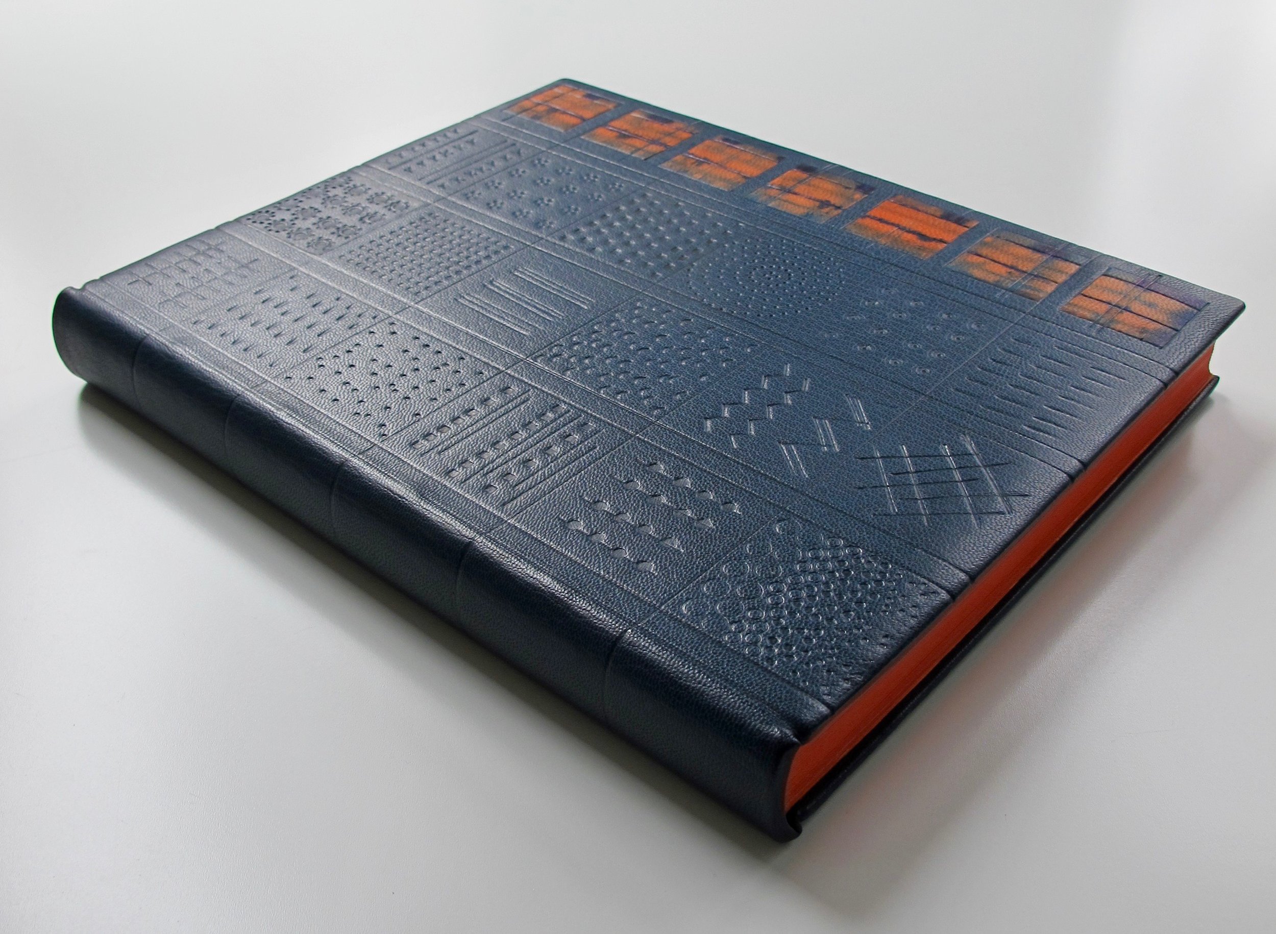
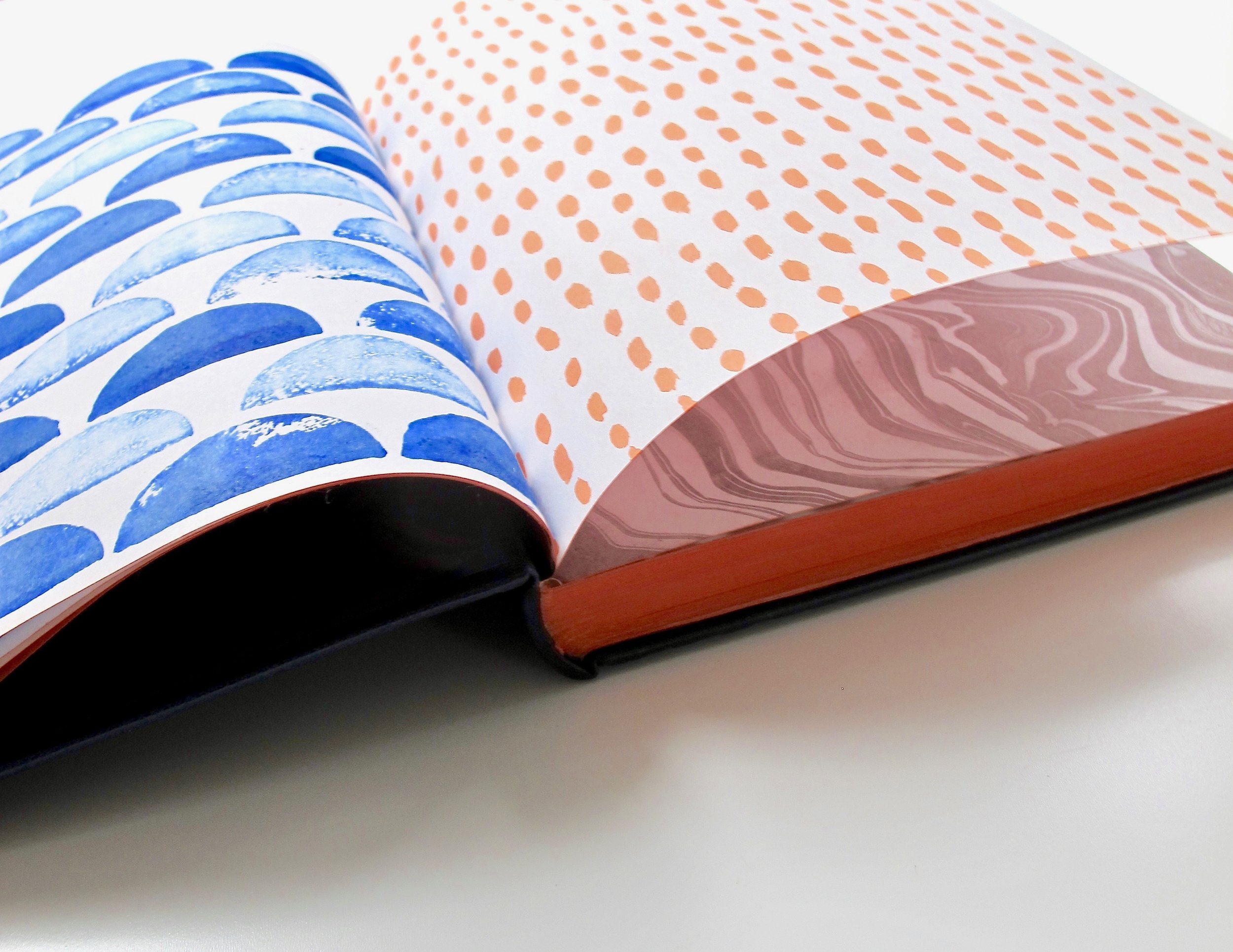
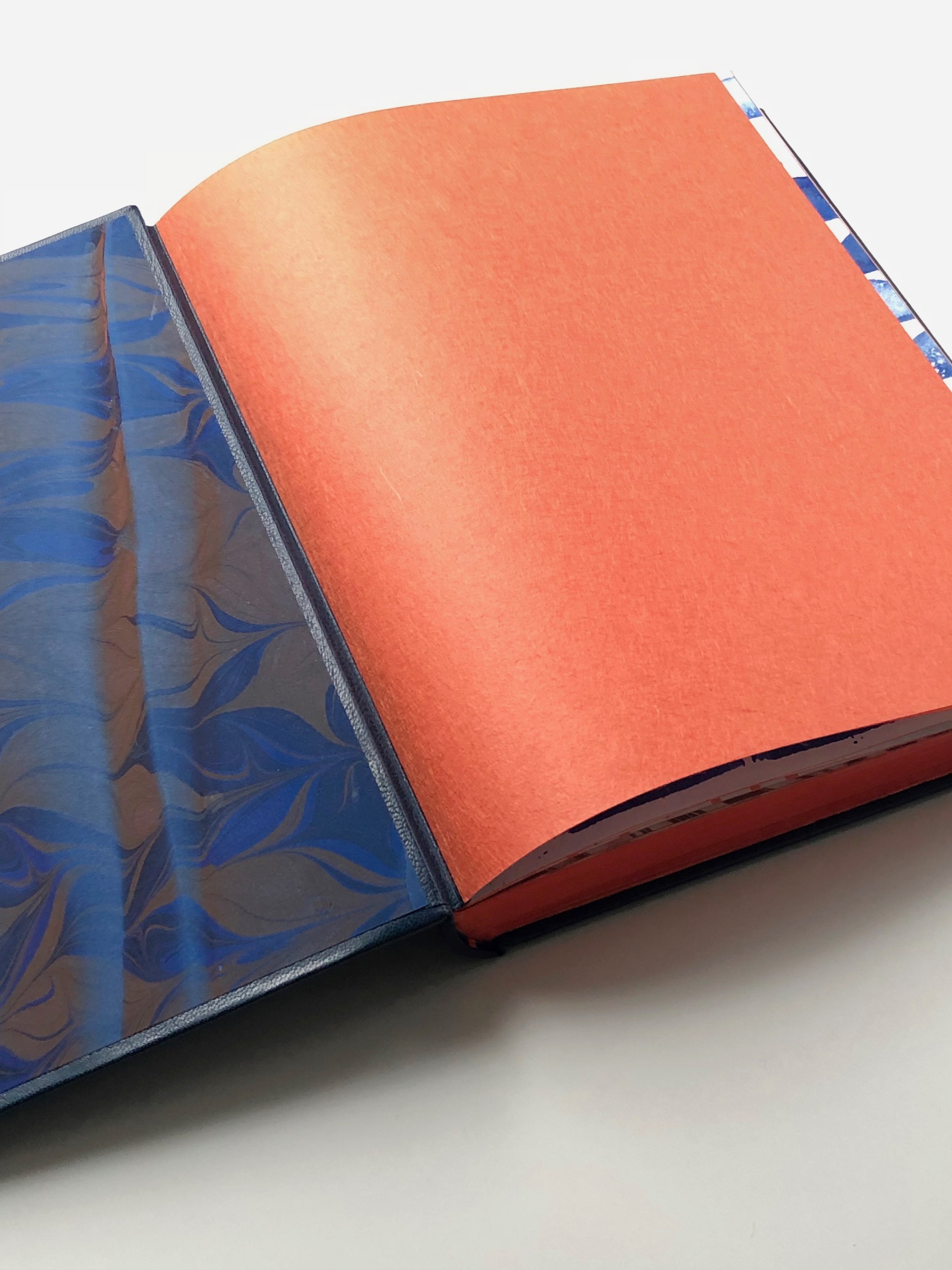
My first step in creating my binding was to make a first and last section of the book with pages that I painted/printed with patterns that are shown in the book. I decided to use a color palette that was based on the colors of the original cover and orange edge treatment. This I thought was enough preparation to do my endbands and bind the book (which I did in class).
When I got home from class I got to work on my cover design. Below are all the things I tried to make my vision of the book a reality. After taking a class with Nicky Oliver at NBSS I finally started to realize that these are all great things to do to explore your idea but they are things that I could and should do before I even bind the book. Since this particuIar book was a book for school I didn’t take the time to plan if beforehand but it is something that I’m pledging to do on all of my books to come.
My thought process on designing this book and how my idea evolved:
I liked the idea of a collage of onlays/inlays that were like a mood board and I liked it when I laid it out on my paper pattern BUT the paper pattern was light grey newsprint and when I laid it out on the navy goat skin I didn’t like the contrast. In generally prefer things to blend more. So that idea was out.


2. I thought about using the actual color palette (ugh! not good). But something about that idea gave me the idea of the grid.
Instead of laying this out on a placquette I put on the color onlays (and started my grid) but I wasn’t happy with it. That idea was out but now I had some things on my book that I couldn’t change (verticle lines and scratch marks under my onlays).
I’m not so excited to share this picture, but it was a part of the process and even a bad idea can spark something in your mind about what a good idea might be. Knowing what you don’t like can be as important and knowing what you do like.
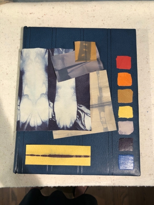
3. I started creating some patterns on leather scraps using blind tooling and some with paint. I loved the little pieces of leather that I painted but I couldn’t see how they worked with the binding. In general I like colors that blend more or a more subtle palette and this was anything but subtle.
I did like the blind tooling and learning from my past mistakes of just going for it I made a pattern and tried many different designs off the book.


5. I started thinking of the cover as just one of the colors in the palette (not a representation of all of the colors). And even though I loved my hand painted leathers I didn’t like them on the cover. I had other elements of the book to bring these colors in: edge decoration, end-bands, paste downs, flyleaves, first sections of the book and the pages themselves.
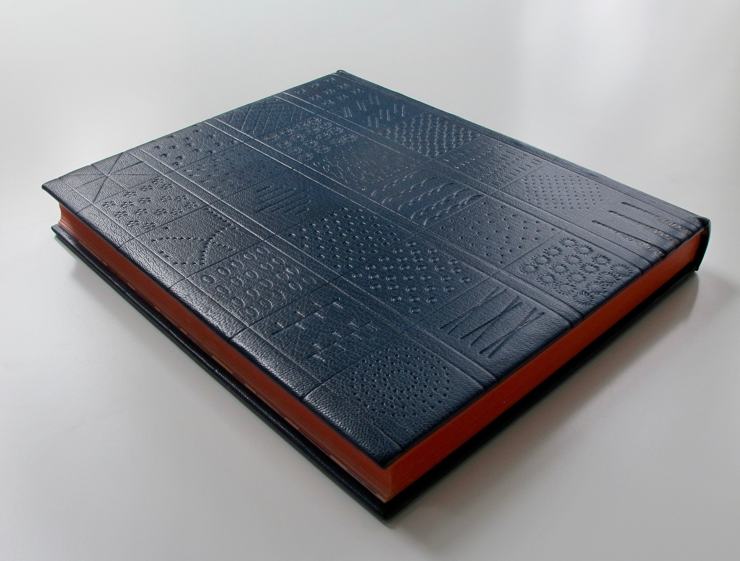
6. I wanted to try just orange and navy and to bring in a method of the book - shibori dying. So I hand dyed a piece of calfskin orange to match the edges and then I shibori dyed it. I knew I was getting closer to something I liked and started finalizing the design.
Because I had already scraped under the colored onlays I originally placed, I had to arrange my placement of the new pieces to cover up what I had previously done - not a lot of wiggle room. I did end up using some leather “band-aids” to cover up spots and used tape/a needle to bring up some marks I’d made.


After putting on my new onlays I thought I needed some little thing to incorporate them into the design so I blind tooled over the navy lines in the onlays and extended the horizontal lines onto the cover. I really liked how this looked.

My last thing to do was to add my paste downs and end sheets. I searched hi and low for a paper that I liked and realized I had to make it myself. I decided to marbled a pattern that was called a double cable getgel. Patterns are not my specialty when I marble. I love to do very free designs so this was a challenge for me. I needed a new tool which my husband agreed to make (lucky me) and then I was off, determined to get this righ. I made several attempts and the one I finally chose was one that was laid out in the pattern but decided to print it using a moire pattern which makes a wave like pattern and skews the design. That was my winner! Yeah for the free flowing patterns!


As it turns out I love how this book came out and I’m not sure how it could or would be different if I’d planned it all out from the start. I tend to be the kind of person though that doesn’t lean toward drama and if I could have saved myself the many little crisis moments while making this I would have. So I’m sticking to my pledge to plan first and create second.
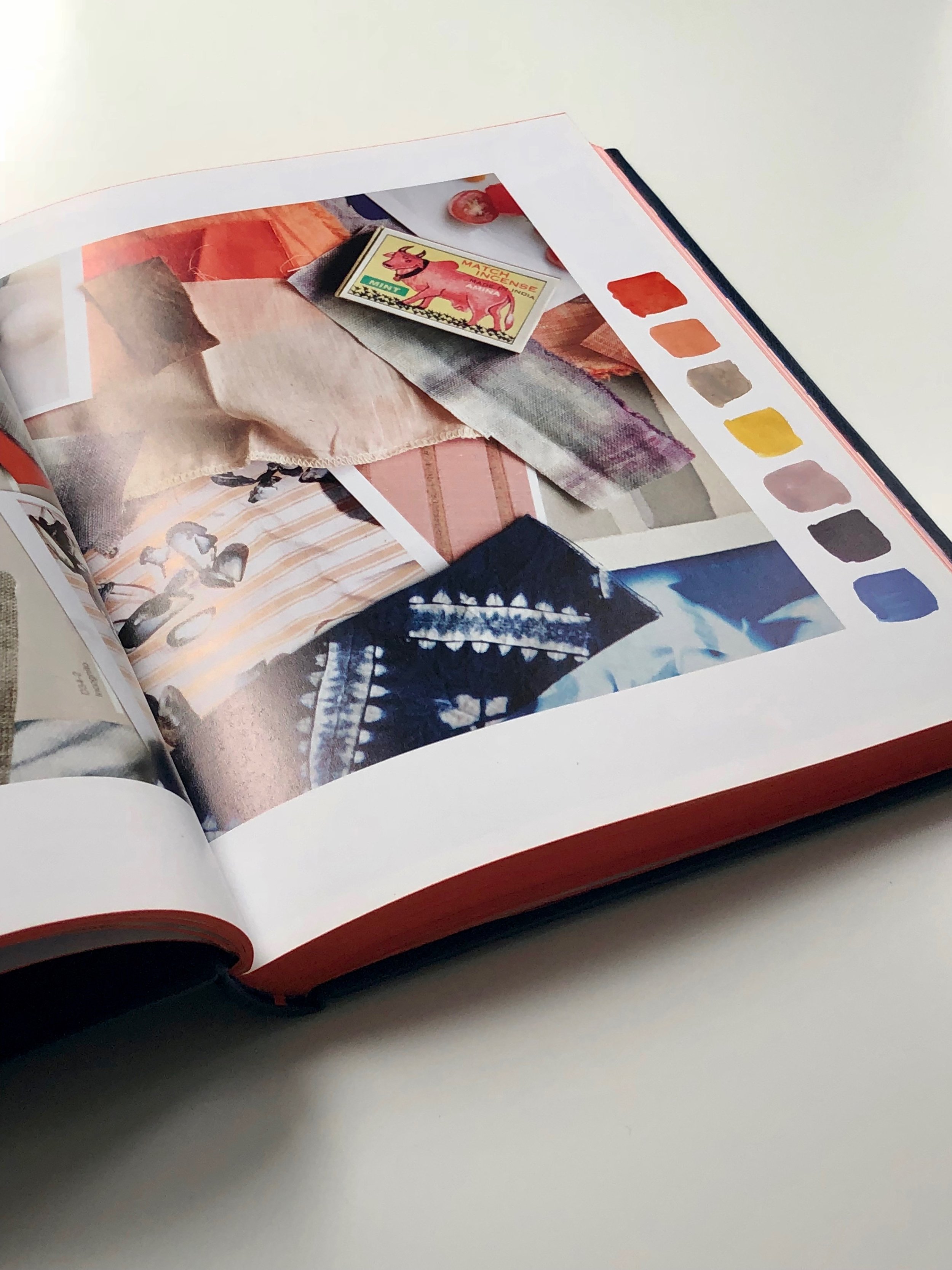
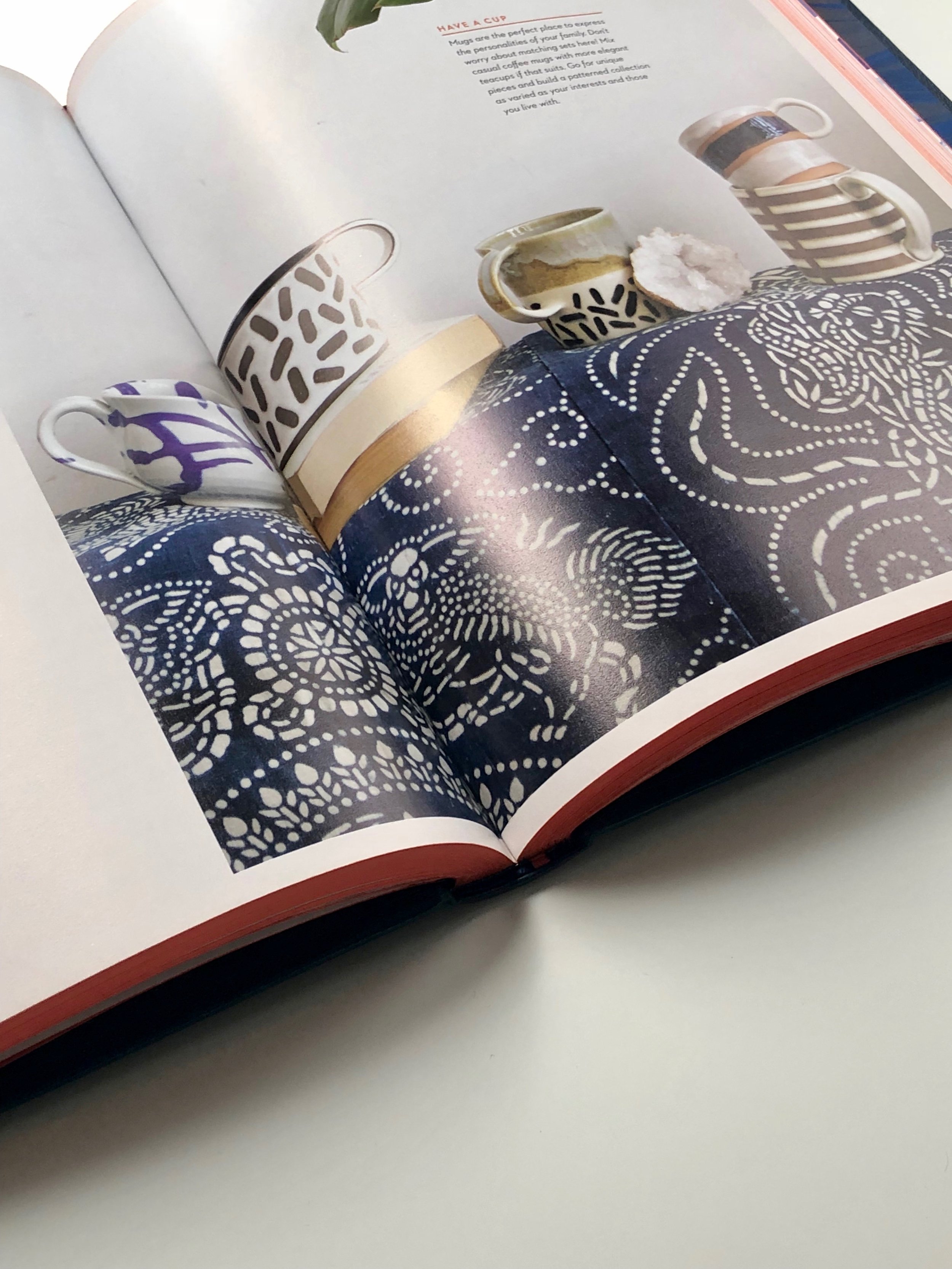
As I finish I wanted to show you one of the key things in the book that led me to the idea of my bind tooling patterns. The words from Rebecca herself….

happy binding!
